You pull into the station on a cold January morning, fuel light blinking, fingers stiff on the steering wheel. Prices glare back from the tall sign by the road, but once you’re actually at the pump, it’s the same old routine—tap the screen, lift the nozzle, watch the numbers spin. Somewhere between litres and euros, a familiar thought hits: I have no idea what this really costs me over a year. I just pay and move on.
From 12 January, that moment at the pump is set to change—quietly, almost politely. A new line of information will appear right where you’re standing. Easy to miss. Easy to underestimate. Yet it could slowly alter how you think about every fuel stop you make.

Because this time, the number won’t just be about litres.
From “price per litre” to “price per 100 km”: what’s changing at the pump
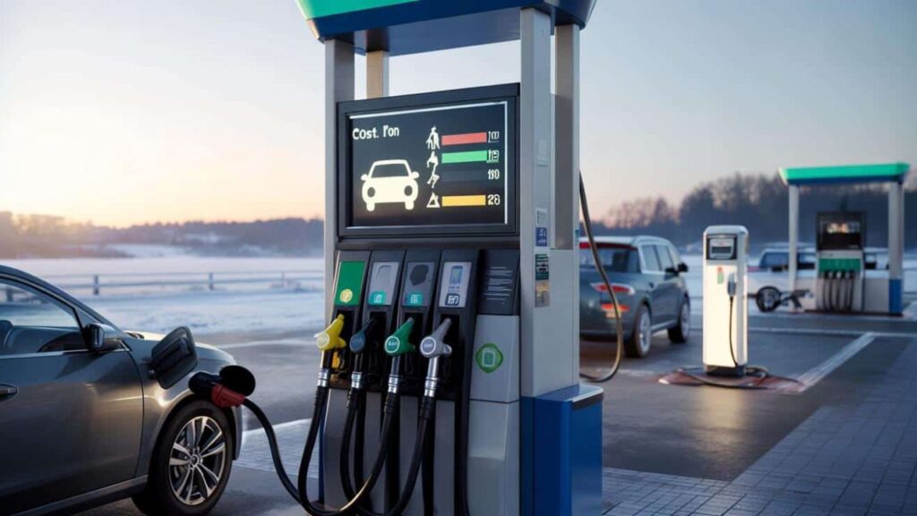
From 12 January, service stations across parts of Europe will be required to display an estimated average cost per 100 kilometres alongside the traditional price per litre (or per kWh for electricity). Not on a dusty noticeboard inside, but directly on or next to the pump—where drivers actually look.
The idea is simple: instead of forcing drivers to mentally convert litres, consumption, and tank size, the pump will translate that into a language people understand. What does 100 km of driving roughly cost with this fuel?

That one shift turns an abstract price into something personal. Your commute. Your school run. Your weekend trip. Suddenly, fuel stops feel less like a blind swipe of the card and more like a concrete budget decision.
This requirement is rooted in broader consumer-transparency rules pushed by European institutions and national authorities, aiming to make energy costs easier to compare across fuels. The European Commission has long argued that drivers struggle to compare petrol, diesel, biofuels, LPG, and electricity because each uses a different unit of sale, a problem highlighted in its consumer energy guidance (https://energy.ec.europa.eu). The “per 100 km” display is meant to level that playing field.
Why regulators think this small label matters
For years, the fuel debate has been noisy but unclear. Diesel is cheaper. Petrol is cleaner. Electric is cheaper per kilometre. Hybrids are “best of both worlds.” Everyone has an opinion, few have numbers they trust.

By forcing all fuels onto the same scale—cost per 100 km—authorities are betting on clarity over persuasion. The aim isn’t to shame drivers or push them into a specific technology. It’s to make the maths visible.
Consumer bodies have consistently argued that people make better financial decisions when prices are framed in real-life terms. The European Consumer Organisation (BEUC) has repeatedly called for clearer fuel-cost comparisons, noting that transparency influences long-term purchasing behaviour more than advertising ever does (https://www.beuc.eu).
In short: when numbers become readable, choices become freer.
What this looks like in practice at the station
You’ll still see the familiar price per litre or per kWh. That doesn’t disappear. What’s added is a second reference point.
For example:
- Petrol (E10): €X per litre → ~€Y per 100 km
- Diesel: €X per litre → ~€Y per 100 km
- Electricity: €X per kWh → ~€Y per 100 km
The figures are standardised estimates, based on average vehicle consumption data defined by public authorities. Stations don’t invent their own numbers. Everyone uses the same reference, which makes comparisons meaningful across brands and locations.
Is it perfect for your specific car? No. But it’s consistent—and consistency is what makes comparison possible.
How to actually use this to save money (without changing your life)
The smartest move is surprisingly small. Before you lift the nozzle, pause for three seconds and look at the “per 100 km” line first.
Ask yourself one human question: With how I actually drive, what does my usual week cost me?
That number lets you scale your own reality almost instantly. A 40 km daily commute? That’s 40% of the displayed cost. A 15,000 km year? Multiply the difference by 150.
Here’s where it gets interesting. A €2 difference per 100 km doesn’t feel dramatic at the pump. Over 15,000 km, that’s €300 a year. Enough to cover insurance, a weekend trip, or a chunk of rising grocery bills.
This is exactly why behavioural economists like cost-per-distance metrics. “People don’t need complex calculations, they need an anchor,” one energy economist told me. “Per 100 km matches how people think about driving. It turns confusion into intuition.”
Everyday strategies this new display unlocks
Once you start reading fuel prices this way, a few practical habits emerge.
Look at the 100 km cost first
Your brain anchors on what actually hits your wallet.
Compare fuels your car already accepts
Petrol drivers often have multiple blends available. Some flex-fuel vehicles can legally use alternatives that suddenly look very different when expressed per kilometre.
Think in yearly distance, not per fill-up
Small differences compound quietly over thousands of kilometres.
Track electric and hybrid costs even if you don’t own one
Over time, you build intuition for when switching might make financial sense.
Use it in real-life decisions
Knowing your true running cost helps when negotiating commuting compensation, choosing between job locations, or comparing a new car to your current one.
A small label today, different car choices tomorrow?
This rule won’t magically fix fuel prices. Stations will still be crowded on Sunday evenings. The total will still sting when it flashes on the screen. But something subtle changes in the background.
Fuel stops stop being a black box.
For some drivers, the new label will barely register. For others, it will finally make sense of long-running debates about diesel, petrol, and electric costs. One quiet day, you may find yourself running the numbers on a hybrid, a shared car, or simply a different fuel—and realising your instincts weren’t wrong after all.
That new line on the pump isn’t there to lecture you. It’s there to whisper a better question: If you truly saw what each 100 km costs you, what would you change—or choose not to change—about how you move?
Key changes at a glance
| Key point | Detail | Value for drivers |
|---|---|---|
| New mandatory display | Cost per 100 km shown at the pump from 12 January | Clear, relatable pricing |
| Energy comparison | Standardised estimates across fuels and electricity | Easier, fair comparisons |
| Budget visibility | Converts small differences into yearly costs | Real savings without lifestyle change |
FAQs:
What exactly must stations display from 12 January?
An estimated average cost per 100 kilometres for each energy type, shown alongside the usual price per litre or per kWh.
Who decides the numbers shown?
Public authorities define the calculation method using standardised consumption data. Stations don’t set their own figures.
Will this change what I pay at the pump?
No. Prices stay the same. Only the information changes.